0103: SFX - Widget Opacity
The most common thing for diminished opacity to signal is that a Widget isn’t currently available. However, it may also be that we want to see what’s behind the Widget(s) while we fiddle with them to set a bunch of settings. To these ends, let’s look at how opacity is changed in GTK.
Setting Opacity
Here’s a straightforward example to start:
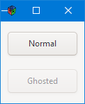
To get that ghosted look for the second Button, its opacity is set using the setOpacity() function… which you’ll find in the AppBox constructor:
button2.setOpacity(0.5);
That’s all well and good, but let’s look at some situations where such a thing might be useful.
A Fake Ghosted Button
Now, when I say “useful,” take that with a grain of salt because we’ll see further along that what we’re about to do—fake a ghosted Button—can be done another way. Still, it’s nearly impossible to predict when something may or may not come in handy, so let’s take a look…
For the sake of reasonable layout management, we’ll toss these buttons onto a Grid like this:
class ButtonGrid : Grid
{
MySwitch mySwitch;
MyButton myButton;
Label switchLabel;
int borderWidth = 10;
int columnSpacing = 10, rowSpacing = 5;
this()
{
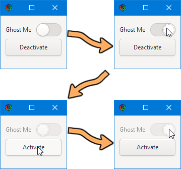
switchLabel = new Label("Ghost Me");
attach(switchLabel, 0, 0, 1, 1);
mySwitch = new MySwitch();
mySwitch.setLabel(switchLabel);
attach(mySwitch, 1, 0, 1, 1);
myButton = new MyButton();
attach(myButton, 0, 1, 2, 1);
myButton.setCompanion(mySwitch);
setBorderWidth(borderWidth);
setMarginBottom(10);
setColumnSpacing(columnSpacing);
setRowSpacing(rowSpacing);
} // this()
} // class ButtonGrid
Why are we looking at this? It never hurts to take a fresh look at aesthetics and all that border, row, and column spacing stuff.
But the main thing I want to draw your attention to is the setCompanion() function (the eighth statement in the constructor). It sets up an association between the Button and the Switch so that clicking on the Button can affect the appearance and behaviour of the Switch, sort of an extension of what we were talking about in Blog Posts 0099: SFX - Button Interactions and 0100: SFX - Button Interactions II, Color, Font, & Shape.
The function is part of the MyButton object:
void setCompanion(MySwitch mySwitch)
{
	companion = mySwitch;

} // setCompanion()
And the action takes place in MyButton’s onButtonPress() callback:
bool onButtonPress(Event e, Widget w)
{
	if(companion.getGhosting() is true)
	{
		writeln("Activating switch");
		companion.switchGhosting(false);
		setLabel(labelText[1]);
	}
	else
	{
		writeln("Deactivating switch.");
		companion.switchGhosting(true);
		setLabel(labelText[0]);
	}

	return(true);

} // onButtonPress()
You’ll notice that the if/else depends on a flag that’s actually a property of the MySwitch object. More about that in a moment. First, take a look at the rocker action of the if/else. If the flag is set, unset it. If not, set it.
But we also change the MyButton label to reflect the state of MySwitch. If you’ve already looked at the complete code file, you may have noticed in the MyButton preamble, as well as having a pointer to a MySwitch object, there’s a string array for Labels:
string[] labelText = ["Activate", "Deactivate"];
And now you know why that’s there.
Breakdown of MySwitch
Starting with the preamble, we have:
Label switchLabel;
bool ghosting = false;
Because a Switch widget doesn’t have the capacity for a label of its own, we give it one by supplying a Label widget. This is the reason for the Grid. In fact, I opted for a Grid so the Label can easily be placed beside MySwitch while MyButton occupies its own row below.
And because this is a Switch, we harness it with the onStateSet signal, hooking up our callback function of the same name, onStateSet() which looks like this:
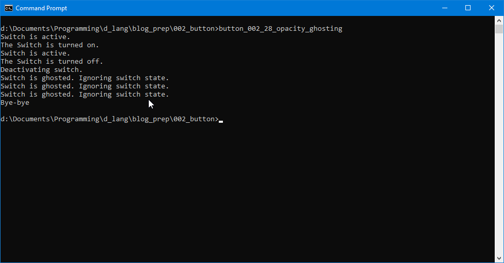
bool onStateSet(bool state, Switch s)
{
	if(!ghosting)
	{
		setState(state);
		writeln("State set is: ", getState(), " and state is: ", state);
	}
	else
	{
		writeln("Switch is ghosted. Doing nothing.");
	}

	return(true);

} // onStateSet()
This handles setting and unsetting that ghosting flag we saw in the preamble. And, like the if/else in MyButton’s onButtonPress() callback, it’s simply a matter of checking the state of the flag and, no matter which state we find, we switch to the other.
And speaking of switching the flag, here’s the function we call from MyButton to do the switching:
void switchGhosting(bool on)
{
	ghosting = on;

	if(on is true)
	{
		setOpacity(0.5);
		switchLabel.setOpacity(0.5);
	}
	else
	{
		setOpacity(1.0);
		switchLabel.setOpacity(1.0);
	}

} // switchGhosting()
At first glance, you may wonder why the argument to this function is named on. By the time you get to the if/else, it should be clear:
if(on is true)
Because if(on is false) tells of the opposite state, right?
And this is where the demonstrated action takes place. We either set MySwitch’s opacity to half (0.5) or full (1.0). Then we do the same thing with the Label, just to demonstrate that this opacity stuff can be set on any Widget.
The rest of this demo is straightforward enough.
Conclusion
Now we’ve seen how to set opacity for three types of Widget:
Button,Label, andSwitch.
But there are a few more circumstances I’d like to cover as well as a completely different approach to ghosting, something that’s actually more natural for GTK and disables the Widget at the same time it ghosts it. And that, we’ll cover next time.
See you then.

Comments? Questions? Observations?
Did we miss a tidbit of information that would make this post even more informative? Let's talk about it in the comments.
- come on over to the D Language Forum and look for one of the gtkDcoding announcement posts,
- drop by the GtkD Forum,
- follow the link below to email me, or
- go to the gtkDcoding Facebook page.
You can also subscribe via RSS so you won't miss anything. Thank you very much for dropping by.
© Copyright 2024 Ron Tarrant