0100: SFX - Button Interactions II – Changing Color, Font, & Shape
Great Smokin’ Widgets! It’s the 100th GtkDcoding Blog Post!
It’s been just over a year since I started this blog and I really didn’t think it would last this long. But thanks to the encouragement and sponsorship of readers—the latter through GtkDcoding’s acceptance into the GitHub Sponsorship program—here we are.
I thank you all from the bottom of my heart. (This is when we clink glasses.)
Now that we’ve had a little bit of a celebration, let’s turn to the subject of the day: continuing to fulfill Joel Christensen’s request to affect the appearance of one Button by clicking another Button.
This time around, we won’t just affect the appearance, but also the colour and shape of the Buttons, all with the help of a CSS object, starting with…
Swapping the Button’s Background Color
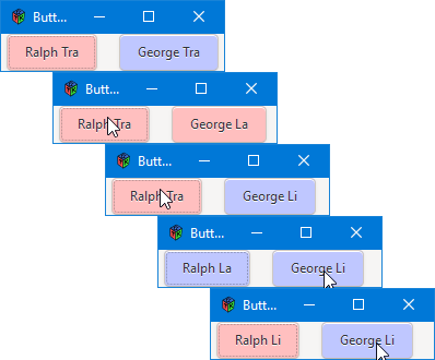
The first demo today will involve the two buttons changing each other’s background colour and for that purpose, we’ll bring back Ralph and George again. To understand the changes that bring this about, we’ll start by looking at…
The AppBox
In the AppBox preamble, we add a single line:
int[string] colorNumbers;
And that’s put to use in the constructor:
this()
{
	super(Orientation.HORIZONTAL, globalPadding);
	colorNumbers = ["red" : 0, "blue" : 1];

	pingButton = new PingPongButton(ralph, colorNumbers["red"]);
	packStart(pingButton, false, false, localPadding);

	pongButton = new PingPongButton(george, colorNumbers["blue"]);
	packStart(pongButton, false, false, localPadding);

	// partner up the buttons
	pingButton.addPartner(pongButton);
	pongButton.addPartner(pingButton);

} // this()
As we’ve had to do before with associative arrays, we hold off initializing the colorNumbers array until the constructor to avoid compiler errors.
Also, this means we’ll be passing in a second argument when instantiating a PingPongButton. We supply not just the button’s name, but it’s initial background color as well. Everything else here is the same.
The CSS Class
As it is in HTML pages, CSS can be dynamic in a GTK application. We’ve looked at CSS before when we discussed Frame borders (Blog Post #0073) and again in the posts covering customized Notebook tabs (Blog Post #0077).
This time, we’ll use the CSS a little differently, but changes to the CSS class aren’t that drastic. In fact, there’s really only one change. In previous examples, we defined one CSS selector for each element, but here, we define two:
enum LABEL_CSS = ".text-button#pingpongred
			{
				background: #FFBFBF;
			}
			.text-button#pingpongblue
			{
				background: #BFC7FF;
			}";
And that’s so we can ping-pong back and forth between them. Speaking of which, let’s look at the changes in the PingPongButton class that make this possible…
The PingPongButton Class
Changes start in the preamble where we add these two lines:
string[] labelNames = ["pingpongred", "pingpongblue"];
CSS css;
If you recall, the way to engage CSS within a GTK application is to associate a CSS selector with the Widget by invoking the Widget’s CSS name. If the Widget doesn’t have a CSS name, we need to supply one that matches a selector defined in the LABEL_CSS enum shown above. To get the Widget to switch between two selectors, we use the labelNames array in PingPongButton to bounce back and forth between the two possible CSS names.
And, of course, we supply the PingPongButton with its initial CSS name and give it access to the CSS object with these statements:
setName(labelNames[color]);
css = new CSS(getStyleContext());
And, as usual, we instantiate a CSS object as the final stage to making the CSS available to the PingPongButton.
Lastly, we add these lines to the onButtonPress() callback:
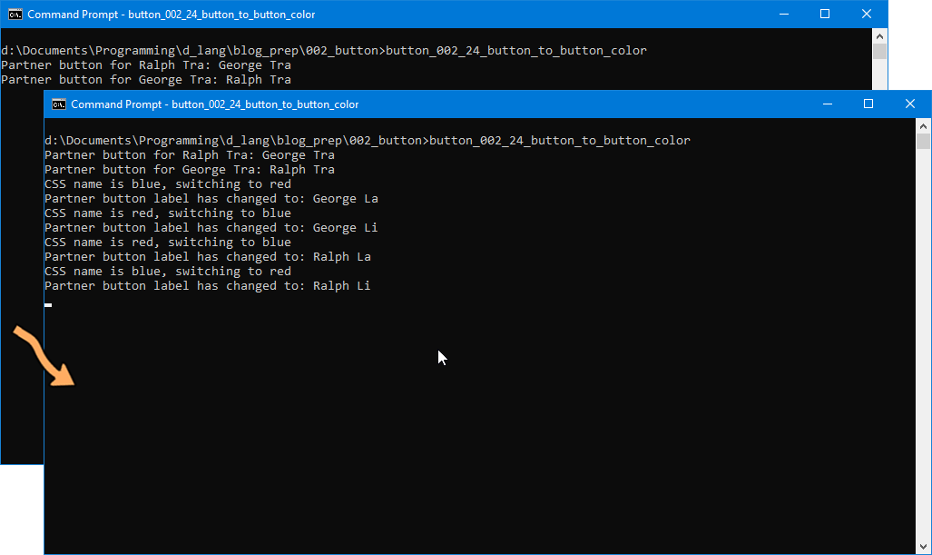
if(partnerButton.getName() == "pingpongred")
{
	writeln("CSS name is red, switching to blue");
	partnerButton.setName("pingpongblue");
}
else
{
	writeln("CSS name is blue, switching to red");
	partnerButton.setName("pingpongred");
}
And that brings about the ping-pong effect in the companion Button.
One Final Example
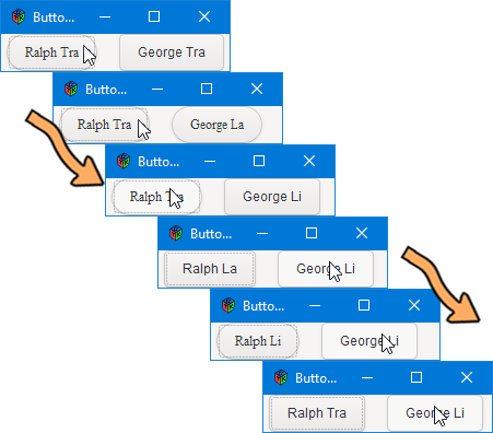
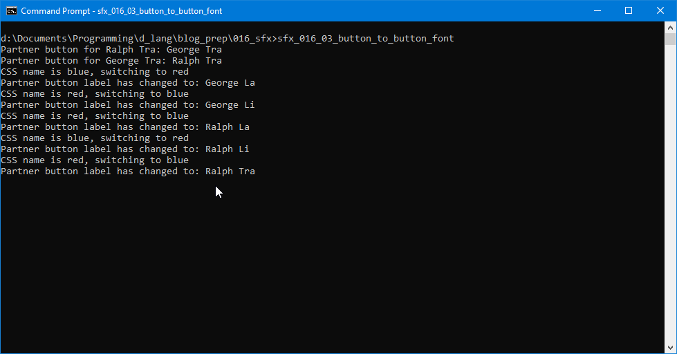
In this demo, we change the font and the roundness of the Button corners, but the only thing we need to do is change the details of the CSS selectors like this:
enum LABEL_CSS = ".text-button#pingpongred
			{
				font-family: Times New Roman;
				border-radius: 20px;
			}
			.text-button#pingpongblue
			{
				font-family: Arial;
			}";
Just a side note: the border-radius rule in the pingpongred selector can be just about any whole number, but for maximum roundness, it’s got to be at least 20. Anything larger won’t make enough visible difference to matter. Anything smaller (you can go as low as 1) will diminish the roundness until the effect is the same as not using border-radius.
Conclusion
And there you have it, another technique you can use to keep your user oriented (or disoriented, if that’s your aim) to changes in your application. It’s not the kind of thing you’d use just any old time, but if you need to—for instance—tell your user to think carefully about clicking Buttons in a certain order, turning one of them red may help get the point across.
And so we bring our 100th posting celebration to a close. Along with those 100 posts go nearly 200 demos of the various features of GTK. I hope you’ve had as much fun reading them as I’ve had writing them.
Hiatus
Because of other commitments encroaching on my time, I’ll be slowing things down here on the GtkD Coding Blog. Postings will be sporadic for a while, but will continue, so keep those cards and letters coming in while I try to sort out the rest of my life. I’ll still be keeping an eye on my email and on the various forums, so if you have questions or comments, please don’t hesitate to get in touch.

Comments? Questions? Observations?
Did we miss a tidbit of information that would make this post even more informative? Let's talk about it in the comments.
- come on over to the D Language Forum and look for one of the gtkDcoding announcement posts,
- drop by the GtkD Forum,
- follow the link below to email me, or
- go to the gtkDcoding Facebook page.
You can also subscribe via RSS so you won't miss anything. Thank you very much for dropping by.
© Copyright 2024 Ron Tarrant