0013: Scrolled Layout
This time around, we’ll be looking at how to do a…
Scrolled Layout


It’s possible to roll your own scrolling layout by creating Adjustment widgets and sticking them in the layout using setHadjustment() and setVadjustment(). But maybe you don’t want to go to all that trouble. It’s far quicker and less work to stuff the Layout into a ScrolledWindow widget instead. So, that’s what we’ll do for now. Sometime down the road, we’ll look into doing it the hard way because now that I’ve said it’s rare to need a Layout done that way, it’s far more likely to come up.
Because there really isn’t any need for a class derived from ScrolledWindow, we’ll stuff it into the TestRigWindow class:
class TestRigWindow : MainWindow
{
	string title = "Test Rig";

	this()
	{
		super(title);
		addOnDestroy(delegate void(Widget w) { quitApp(); } );
		setSizeRequest(200, 200);

		ScrolledWindow scrolledWindow = new ScrolledWindow();
		add(scrolledWindow);

		auto myLayout = new MyLayout();
		scrolledWindow.add(myLayout);

		showAll();

	} // this() CONSTRUCTOR


	void quitApp()
	{
		writeln("Bye.");
		Main.quit();

	} // quitApp()

} // class myAppWindow
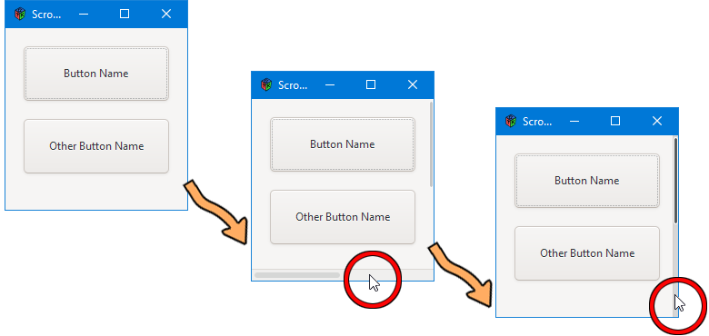
Nothing out of the ordinary here. Create the ScrolledWindow object, add it to the TestRigWindow, then create the Layout and stuff it into the ScrolledWindow.
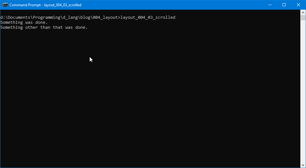
And everything else in this example is similar to what we’ve covered before. Compile and run the code to see the scrollbars. If you’re running on Windows, you may have to look closely to see the scrollbars. I haven’t yet found a way to make them bigger, but when I do, I’ll cover it in a later blog post.
And since that didn’t take much time or effort, let’s look at another example, the tooltip.
Tooltip


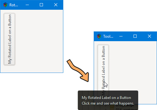
In GTK, it used to be that tooltips took a lot of time and effort to figure out and put into practice, but by the time version 3.x came along, things had changed. Now tooltips are built right in at the generic Widget level, so now it’s like falling off a skateboard, anyone can do it. So, let’s look at the derived Button class to see how it’s done:
class TooltipButton : Button
{
	this()
	{
		super();

		// a rotated label
		RotatedLabel myRotatedLabel = new RotatedLabel();
		add(myRotatedLabel);

		addOnClicked(delegate void(_) { doSomething(); } );

		setHasTooltip(true);
		setTooltipText(myRotatedLabel.getText() ~ "\nClick me and see what happens.");

	} // this()


	void doSomething()
	{
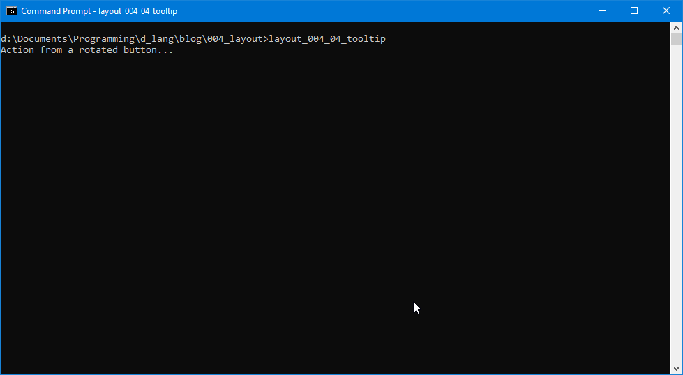
		writeln("Action from a rotated button...");

	} // doSomething()

} // class TooltipButton
This is so easy compared to the original way. All you have to do is:
- tell the Button to use its built-in Tooltip with setHasTooltip(true), and
- tell the Tooltip what to say with setTooltipText(“whatever string you want”).
In the example, I opted to grab the Button’s Label text and put that in the Tooltip along with a message.
There’s that Rotated Label Again
Yeah, it’s one reason which leaps to mind for actually needing a Tooltip on a Button. It’s not the only reason, but if you’ve ever used software with sideways labels, you know it can be a literal pain the neck. Besides, for our purposes, this seems logical, so there it is.
Conclusion
Two for the price of one, a scrolled layout and a tooltip. The coolness just amps up every step along the path here. But now it’s time, gentlefolk, please. So have a good coding experience and I’ll see you next time.
Comments? Questions? Observations?
Did we miss a tidbit of information that would make this post even more informative? Let's talk about it in the comments.
- come on over to the D Language Forum and look for one of the gtkDcoding announcement posts,
- drop by the GtkD Forum,
- follow the link below to email me, or
- go to the gtkDcoding Facebook page.
You can also subscribe via RSS so you won't miss anything. Thank you very much for dropping by.
© Copyright 2024 Ron Tarrant
