0042: Dialogs VIII - Customizing (1 of 3) - Aesthetics
Today we start a three-part series about building a Dialog from scratch.
There’s a range of topics to cover, so I’ve split them up like this:
- Part I deals with how to create an aesthetically-pleasing widget layout for a custom
Dialog, - Part II covers user interaction, and
- Part III brings it all together.
There are two code example files today and they illustrate before and after states of using design principles.
The first one is…
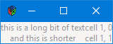
Life Before Aesthetics

But I’ll let you know right now, the only code quoted here is from the second one because… well, there’s no point in showing the code for a bad layout, right? Seeing the bad layout will be traumatizing enough. So…
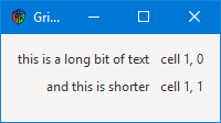
Life After we Study Design
Anatomy of a Dialog Window
A custom Dialog has two areas you need to deal with:
- the content area, and
- the action area.
It’s not complicated, but besides presenting information and soliciting user interaction, we also have to come up with a way to make everything we stuff into the content area look good. Since the Table widget has been deprecated, the easiest way to do this now is with a Grid.
But before we get to how the content area is built, I’d like to go over a few basics of how to make an appealing layout. This isn’t only about lining things up, but also keeping them from looking cramped and helping the user’s eye see the important stuff.
A Brief Introduction to Design
Note: Be advised that when I speak of layout, I’m not talking about the Layout Widget. I’m talking about the design concept of layout.
The approach I’ve taken to controlling layout is elementary and easy to implement:
- each widget in a layout is placed in its own
Box, and - the boxes are then stuffed into
Gridsquares.
This allows:
- each
Boxto have elbow room, that is: separation from the contents of otherBoxes in the design, and - column or row justification can be done easily on a column-by-column or row-by-row basis.
Because I learned about design in art college, I feel more comfortable speaking that language when it comes to layout. So I’ve taken the liberty of translating from coder speak to artist speak so you can then take your pick when you’re doing your own stuff. Here’s what I came up with…
In design terms, alignment is:
- left-justified,
- right-justified, or
- centre-justified.
Anyone who’s used a word processor or desktop publishing application knows these terms, too, so I came up with this enum:
enum BoxJustify
{
	LEFT = 0,
	RIGHT = 1,
	CENTER = 2,
	TOP = 3,
	BOTTOM = 4,

} // PaBoxJustify
This allows us to speak in designerly terms. And by the way, CENTER is used for either horizontal or vertical centering.
Padding vs. Border & Margin
There are at three ways to get extra space around a widget:
- padding,
- border, and
- margin.
And here’s how GTK uses them:
- padding controls the space around all four sides of a
Widgetwith a single setting, - border does the same, and
- margin is used to set top, bottom, right and left individually.
Technically, padding is inside the confines of the widget and border is outside, but the effect for our purposes is the same with either. In deciding which to use, I looked at which widgets have each of these:
- the
Widgetand all its sub-classes have margin settings, - the
Containerand all its sub-classes have border settings, and - only the
Boxhas padding.
That means we can use the border property of any Container-derived Widget to get the control needed to make a layout look good.
So what’s the margin for?
One of the things designers discovered eons ago is that having the same amount of space at the top and bottom of a design doesn’t quite look right. A bit of extra space at the bottom makes things feel more balanced. And ‘feel’ is the right word because it’s an optical illusion, but such is the nature of the human mind.
So, here are the guidelines I use:
- set overall spacing with
setBorderWidth(), and - use
setMarginBottom()for that final, aesthetic touch.
Also, this blog tries to be as forward-facing as possible and with GTK 4.0 deprecating the use of padding, that leaves us with border and margin.
Keep in mind that the border is the space between a Container and its parent, so:
- the
Grid’s border is between itself and theDialog’s Content Area, and - the
Box’s border is between itself and theGridsquare(s) containing it.
We don’t need to bother with the spacing between a child widget and its Box container (and that’s a good thing because most child Widgets won’t give us that control anyway). Now let’s get into the classes…
The HPadBox
Here’s the initialization chunk:
class HPadBox : Box
{
	private:
	Widget _widget;
	int _globalPadding = 0;
	int _padding = 0;
	bool fill = false;
	bool expand = false;
	int _borderWidth = 5;

	BoxJustify _pJustify;
We still have variables for _globalPadding and _padding, but they’re both set to 0 so they don’t get in the way… for now. GTK 4.0 compliance will mean calls to the Box constructor will need one less argument, but we’ll deal with that when 4.0 is released because for now, we still need them:
- the
Boxconstructor still expects global padding, and - the
packStart()orpackEnd()functions expect local padding.
The _pJustify variable will be one of the values from the BoxJustify enum discussed in A Lighting-fast Introduction to Design above.
The Constructor
Here’s the meat-n-taters of this class:
	public:
	this(Widget widget, BoxJustify pJustify)
	{
		_widget = widget;
		_pJustify = pJustify;

		super(Orientation.HORIZONTAL, _globalPadding);

		if(_pJustify == BoxJustify.LEFT)
		{
			packStart(_widget, expand, fill, _padding);
		}
		else if(_pJustify == BoxJustify.RIGHT)
		{
			packEnd(_widget, expand, fill, _padding);
		}
		else
		{
			add(_widget);
		}

		setBorderWidth(_borderWidth);

	} // this()

} // class HPadBox
Because the constructor’s first argument is a Widget, it’ll accept whatever widget you wanna drop into it… a Label, an Entry, whatever. We’ll talk more about that mechanism in a moment, but first let’s finish off this justification stuff…
Boxes in the latest incarnation of GTK are genericized. GTK 2.x had an HBox and a VBox, but now we have the plain ole Box and—you’ll recognize this from earlier blog posts—the Box’s constructor is passed a directional Orientation:
Orientation.HORIZONTAL, orOrientation.VERTICAL.
And because the Box is generic, the orientation changes the meaning of packStart() or packEnd():
- with
Orientation.HORIZONTAL:packStart()means left justify, andpackEnd()means right justify,
- with
Orientation.VERTICAL:packStart()means top justify, andpackEnd()means bottom justify.
With either Orientation, add() means center justify.
You can probably guess how this all pans out, but here it is in black-n-white: the BoxJustify enum values translate to:
Orientation.HORIZONTAL:LEFT=packStart(),RIGHT=packEnd(), orCENTER=add(),
Orientation.VERTICAL:TOP=packStart(),BOTTOM=packEnd(), andCENTER=add().
This example doesn’t have a VPadBox, but you’ve got the tools now to figure out how that would go together. Now let’s move on to the child widget used with HPadBox…
The HPadLabel
This class is derived from the HPadBox class, but not the Label class. Instead, the Label becomes a property of the class and is passed to the super-class constructor where it’s treated as a generic, incoming Widget. D only allows a class to inherit from a single super-class, but this way we can sidestep that limitation and sneak in a second one… sort of:
class HPadLabel : HPadBox
{
	Label label;

	this(string text, BoxJustify pJustify)
	{
		label = new Label(text);

		super(label, pJustify);

	} // this()

} // class HPadLabel
And that takes care of keeping our widgets separated from each other within our GUI design. Now let’s look at how the entire design fends off border encroachment by the Window.
Note: In case you didn’t want to take the implied challenge above…
A VPadBox can be interpolated from the HPadBox by changing the name and switching LEFT to TOP and RIGHT to BOTTOM. Then you could derive a whole set of VPadXxxx widgets to go with it. And as usual, if you want to discuss any of this, I invite you to respond to one of the GtkD threads in the Learn section of the D-lang forum or start a thread on GtkD.org (see the links below).
The PadGrid
This is pretty straightforward:
class PadGrid : Grid
{
	private:
	int _borderWidth = 10;
	HPadLabel zeroZero, oneZero, zeroOne, oneOne;

	public:
	this()
	{
		super();
		setBorderWidth(_borderWidth);
		setMarginBottom(10);

		// row 0
		zeroZero = new HPadLabel("this is a long bit of text", BoxJustify.RIGHT);
		attach(zeroZero, 0, 0, 1, 1);

		oneZero = new HPadLabel("cell 1, 0", BoxJustify.LEFT);
		attach(oneZero, 1, 0, 1, 1);

		// row 1
		zeroOne = new HPadLabel("and this is shorter", BoxJustify.RIGHT);
		attach(zeroOne, 0, 1, 1, 1);

		oneOne = new HPadLabel("cell 1, 1", BoxJustify.LEFT);
		attach(oneOne, 1, 1, 1, 1);

	} // this()

} // class PadGrid
The _borderWidth variable does the heavy lifting while setMarginBottom() adds the aesthetic touch.
Also, in case it isn’t obvious, the HPadLabels are named for their positions within the Grid.
Conclusion
And that’s it for this time. Far from being an exhaustive or even comprehensive guide to design and layout, follow these few rules and you’ll at least be headed in the right direction:
- separate each widget from its parent and siblings by stuffing it into a
HPadBox,VPadBox, or something of your own devising. Then usesetBorderWidth()to give them elbow room, - stuff each
HPadBoxinto aPadGridand separate it from the containing widget (Window, Content Area, etc.) withsetBorderWidth(), - set up left-, right-, top-, or bottom-alignment with the
BoxJustifyenum, and - give the
PadGridan aesthetic bit of extra space viasetMarginBottom().
Neither be stingy nor overzealous with border width or the bottom margin. Use glossy print magazine page layouts as guides to this whole space-around-elements thing.
See you next time for Part II.

Comments? Questions? Observations?
Did we miss a tidbit of information that would make this post even more informative? Let's talk about it in the comments.
- come on over to the D Language Forum and look for one of the gtkDcoding announcement posts,
- drop by the GtkD Forum,
- follow the link below to email me, or
- go to the gtkDcoding Facebook page.
You can also subscribe via RSS so you won't miss anything. Thank you very much for dropping by.
© Copyright 2023 Ron Tarrant